Monolith Construction Co. Logo Design
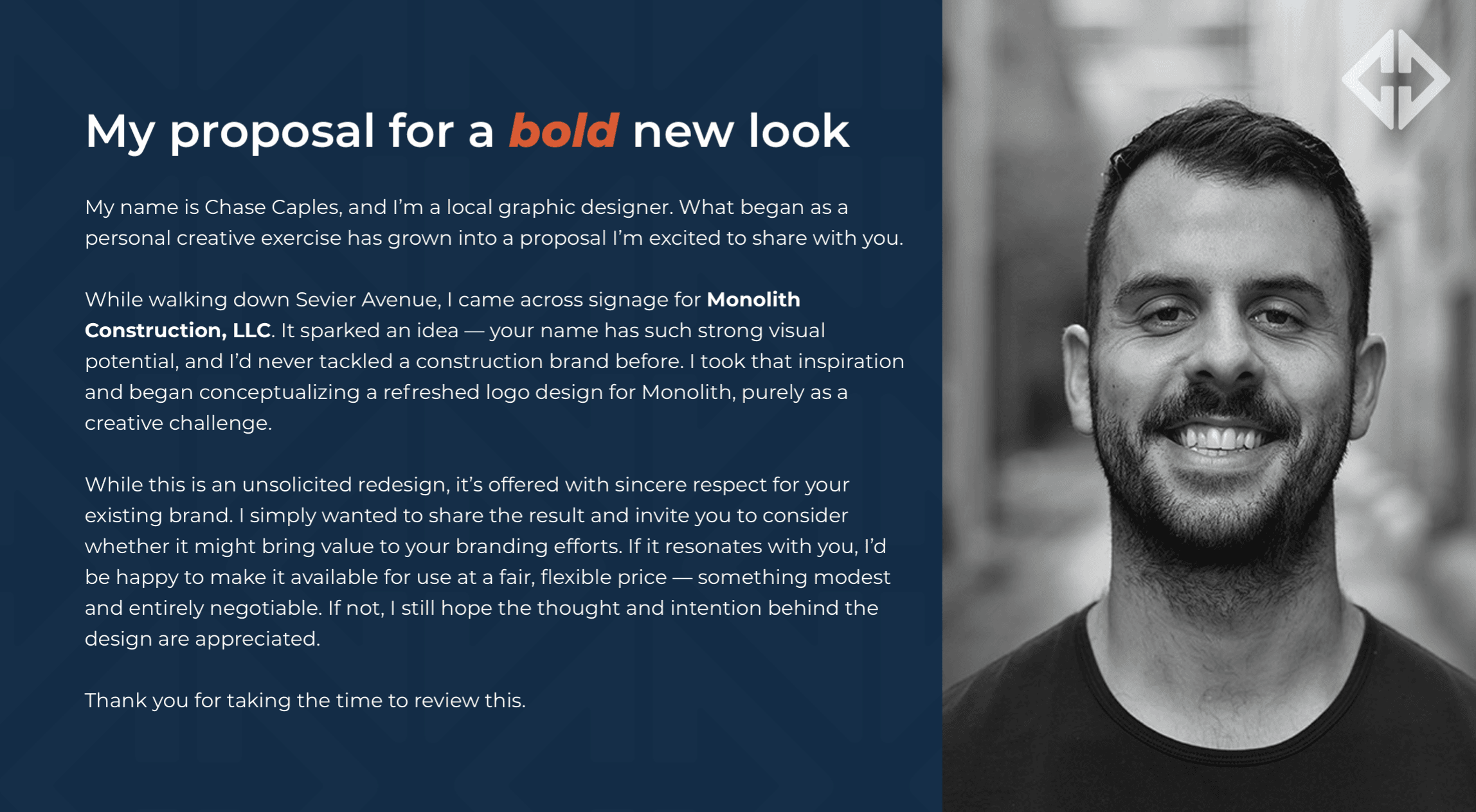
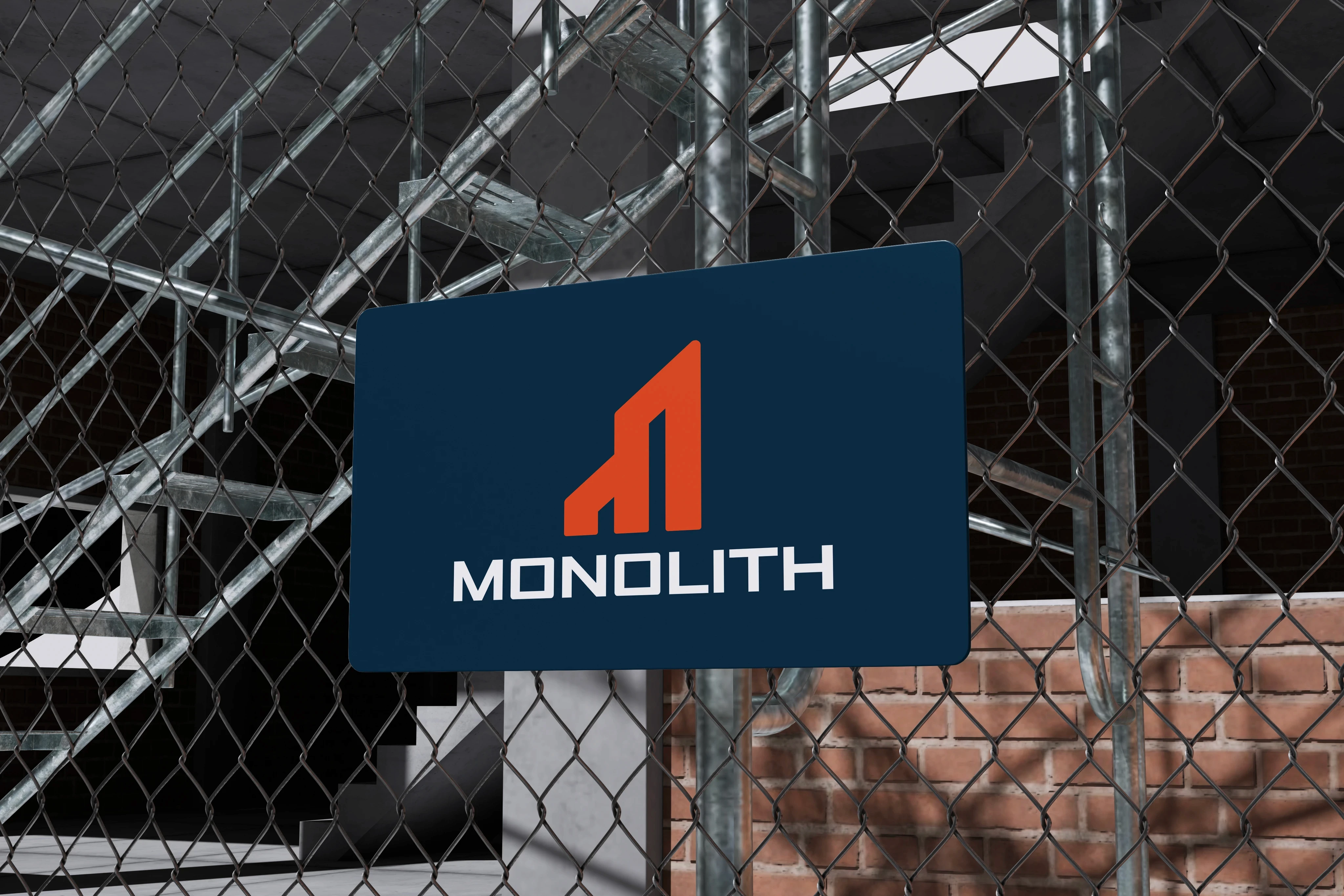
The Monolith logo represents a passion project exploring brand identity for the construction industry, inspired by Monolith Construction Co. in Knoxville. This design is my own independent creative exercise and is not affiliated with or associated with the company in any official capacity.
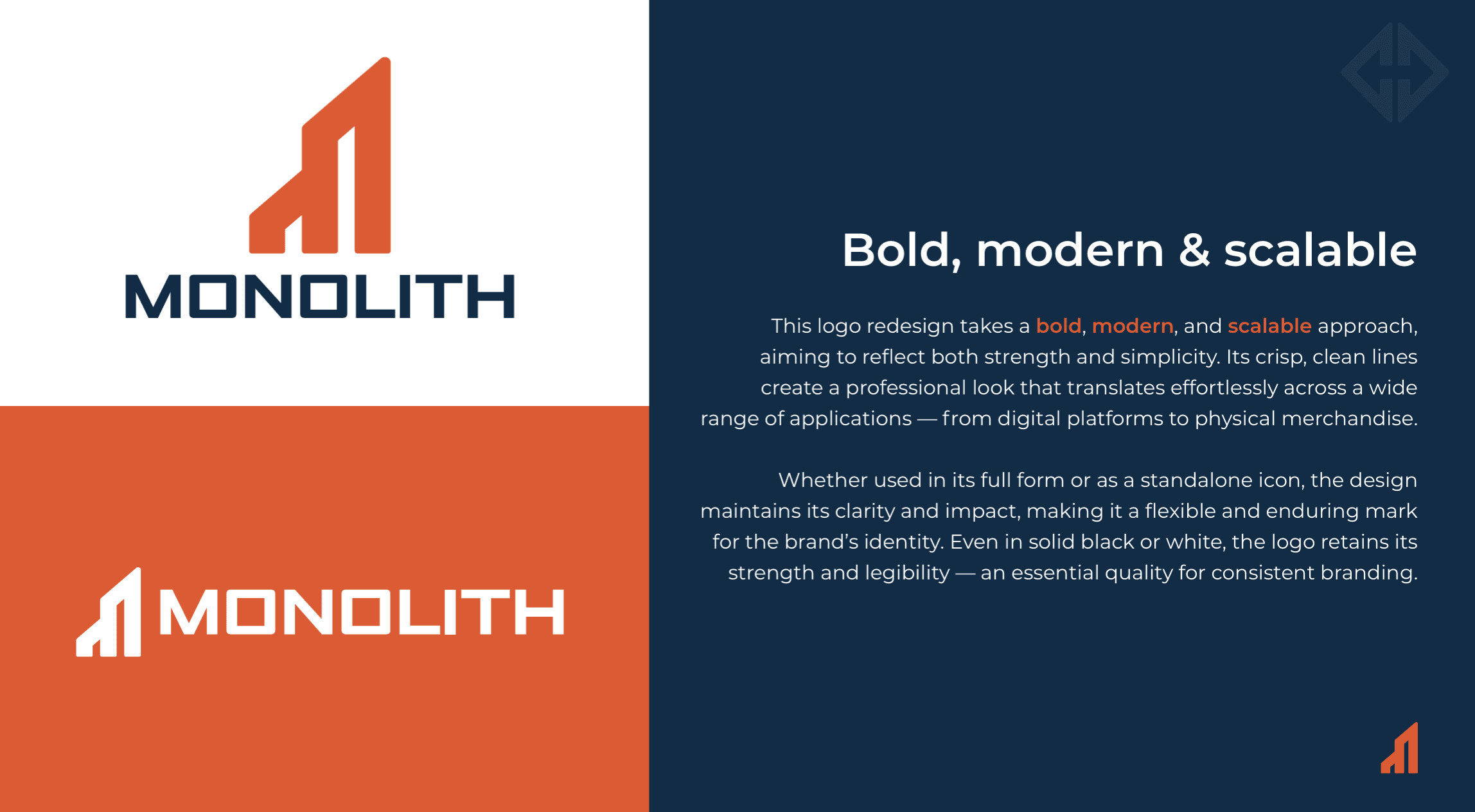
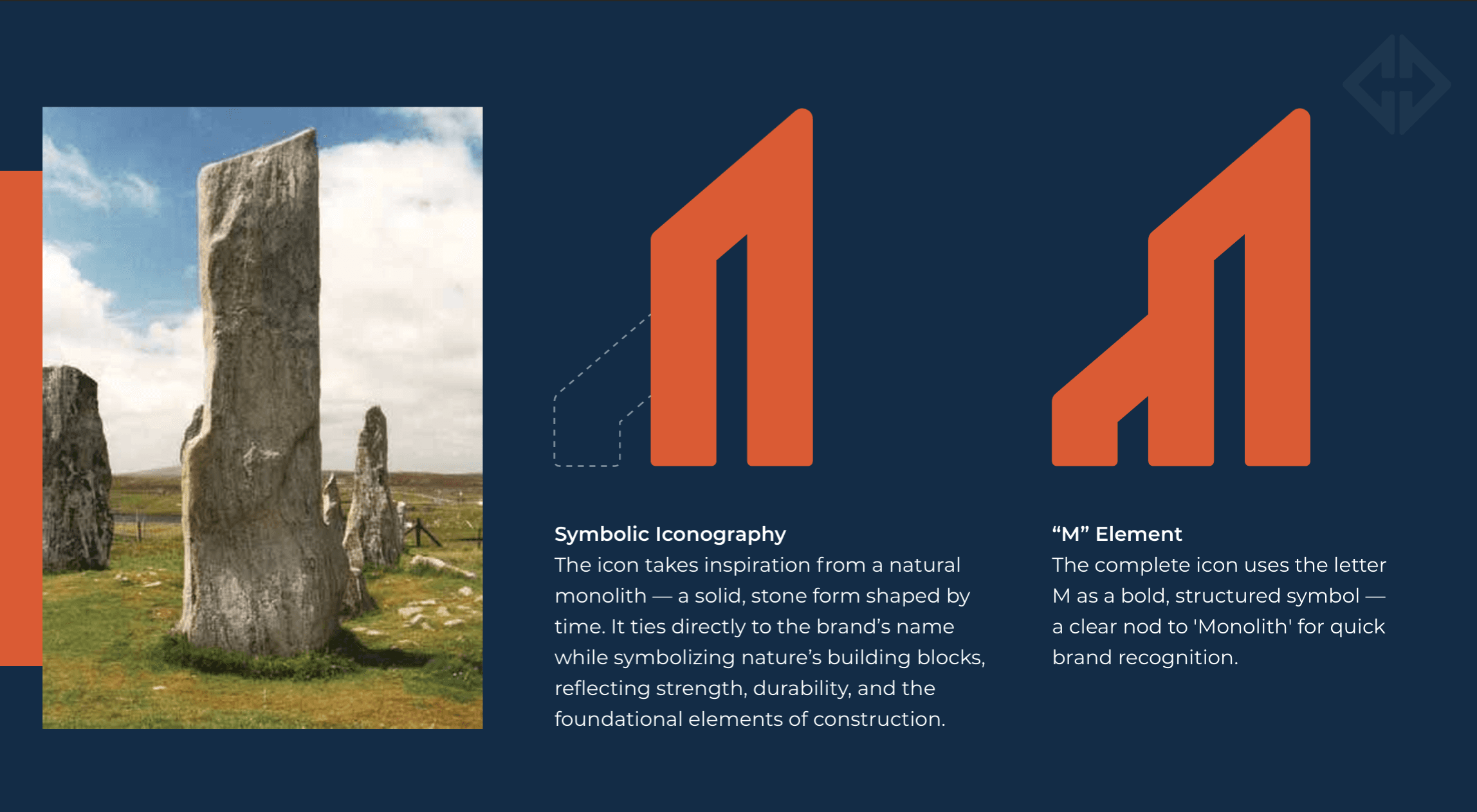
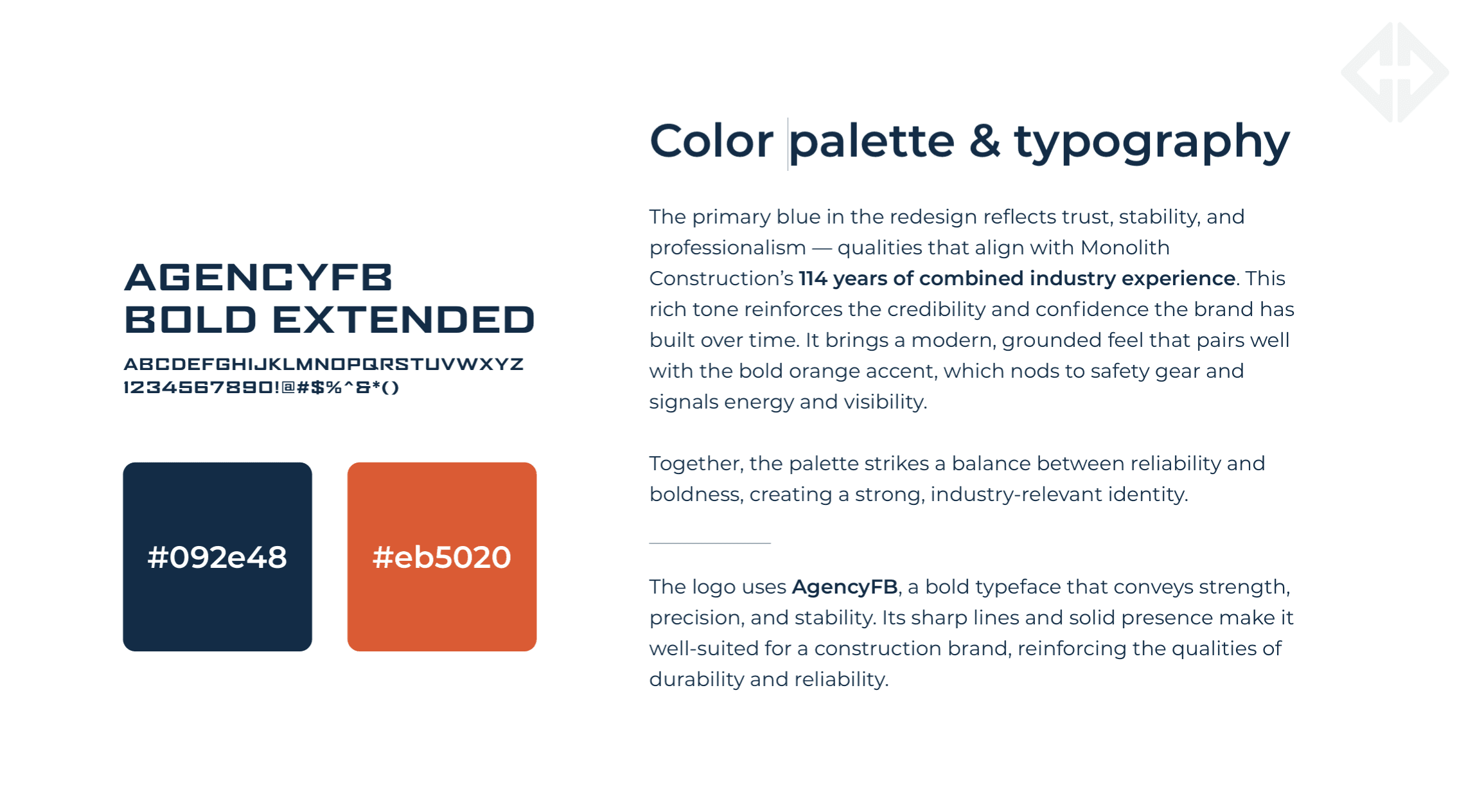
While the design was presented to the company and ultimately not adopted, it remains a meaningful example of how thoughtful design can communicate core brand values. The logo emphasizes a bold, structured aesthetic that reflects strength and craftsmanship through minimal, geometric forms. The "M" icon is intentionally shaped to resemble a stone monolith, reinforcing themes of durability, permanence, and architectural integrity.
The accompanying slide deck represents the actual proposal I sent to Monolith Construction Co., showcasing the complete brand system and demonstrating how strategic design choices can elevate a local business's visual presence and market positioning.