Challenge
Marcus & Associates is a senior housing investment brokerage firm that needed its first logo. The company previously had no established visual identity beyond its name, and the founder wanted something modern and minimal.
The primary challenge was incorporating the company name or initials into a professional mark that could work across a range of applications.
Approach
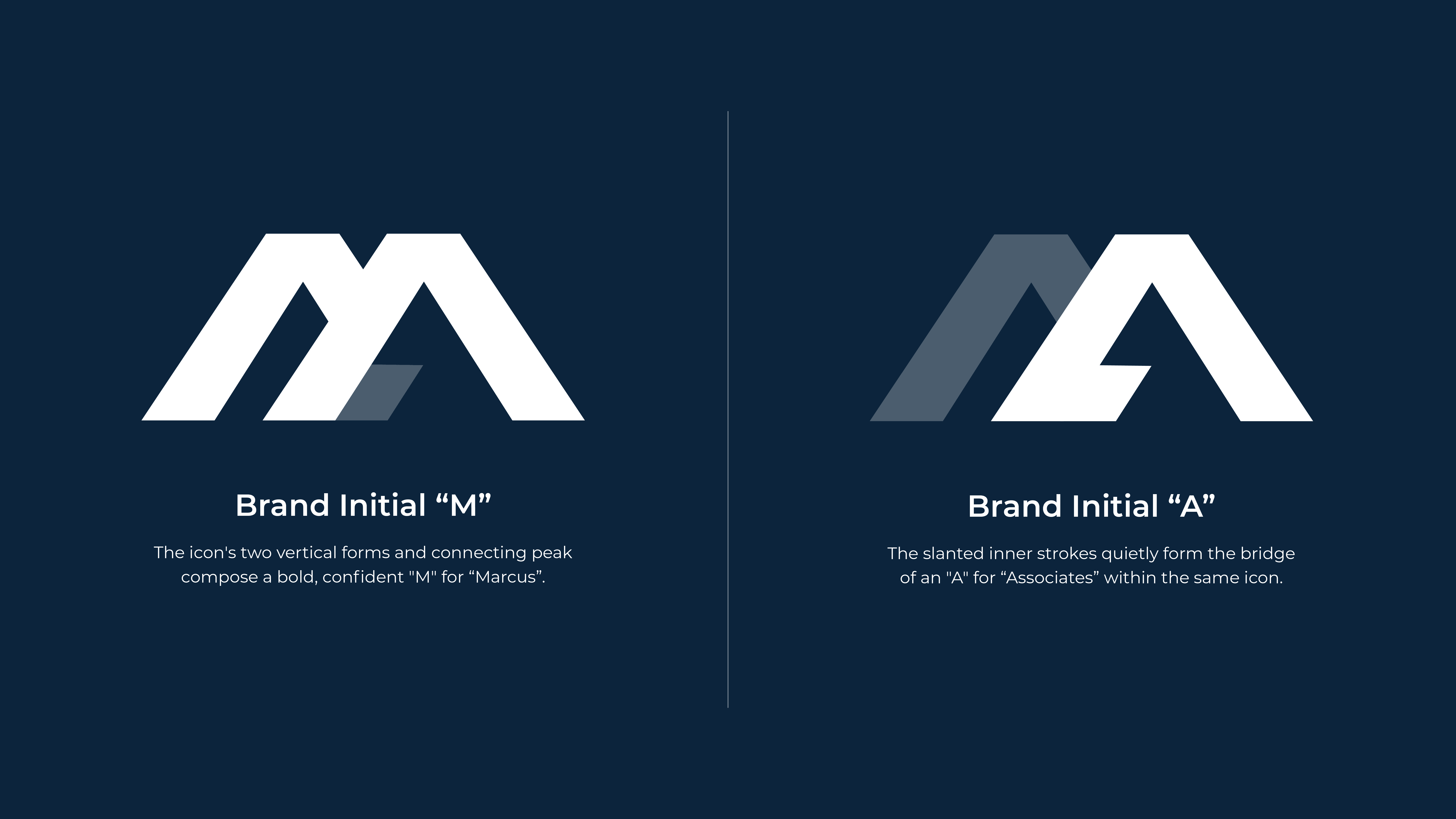
I focused on an M + A monogram as the foundation for the identity.
The goal was to create something bold, confident, and professional while remaining appropriate for the investment industry. Because the company uses the founder's name, I also wanted the identity to reflect his tone and personality without making the brand feel like a personal brand.
The monogram approach provided a simple visual structure that could be easily recognized and scaled across different applications.
Solution
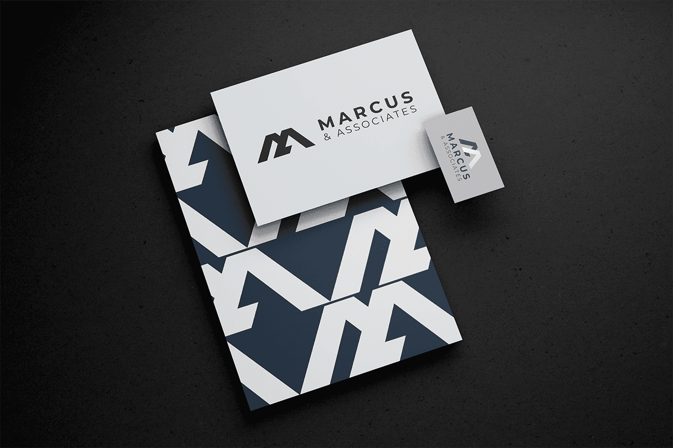
I developed the monogram into a flexible logo system with stacked and horizontal configurations, color and black-and-white versions, and multiple production-ready file formats.
The identity was ultimately implemented on the company's website.
Outcome
The concept received almost immediate approval from the client, who loved the final direction.
The project demonstrated my ability to take a relatively open-ended brief, establish a clear visual direction, and deliver a professional identity that met the client's expectations.